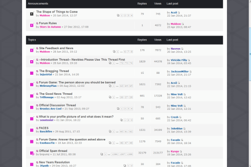
See, one of the things I liked about the old format is the fact that the site was unique. While I don't have anything against the current style on a layout basis, the background being that mottled gray just makes the site look sort of generic; it doesn't
pop the way it used to. Maybe the colors were a
bit garish, but they at least made it easy to follow the format. Now, everything sort of gets lost in the gray and black. Monochrome looks cool, but it makes following threads a good deal harder.
New format:
http://puu.sh/6vi22.pngOld format:
http://puu.sh/6vi2K.pngSee how with the new format it kind of just looks like one big section (maybe two if the header is counted, even though the color there is sparse as well)? Whereas the old format is clearly divided by brightly contrasting bars and headers to let you know where one block ends and another begins. If we could add more color to the scheme, the new site format would be a lot more vibrant, inviting, and easy to use.
It's the same problem I have with Everfree Network; There's too little color besides black, white, and gray to see where things are clearly.


