- Code: Select all
Parse error: syntax error, unexpected '}' in /home/content/61/8047561/html/cache/tpl_Xand-Pony_viewtopic_body.html.php on line 92
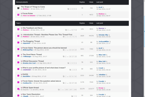
The Shape of Things to Come
Re: The Shape of Things to Come
![]() by Supersaw Hoover » 23 Jan 2014 00:06
by Supersaw Hoover » 23 Jan 2014 00:06
Hey, for people like me who prefer the old board theme, can you at least make sure Xand_Pony isn't broken? I can't view or reply to threads anymore in Xand_Pony because there's some missing end bracket.

-

Supersaw Hoover - Posts: 213
- Joined: 29 Jun 2011 16:35
Re: The Shape of Things to Come
![]() by Acsii » 23 Jan 2014 00:24
by Acsii » 23 Jan 2014 00:24
Callenby wrote:
It's like this everywhere and it doesn't sound like it's supposed to be this way. The only color is from the "unread message" or "Site Admin" signifiers. Can you post a screenshot of how it looks to you?
Avatars are magically on the left now, though. So at least there's that.
Also, none of the buttons to alter your post, like Quote or Img, are working. Good thing they aren't hard to remember.
The buttons are broken at the moment, and that's what it's meant to look like
20 something Transgirl that makes sounds called music
Soundcloud | Facebook | Bandcamp | Blog
Soundcloud | Facebook | Bandcamp | Blog
Placing my tongue on the GR meter to taste the gain reduction I some how improved my skills.
-

Acsii - Posts: 2457
- Joined: 19 Apr 2012 01:55
- Location: Melbourne, Australia
- OS: OS X
- Primary: Logic Pro X
- Cutie Mark: Old round oscilloscope
Re: The Shape of Things to Come
![]() by ExoBassTix » 23 Jan 2014 00:54
by ExoBassTix » 23 Jan 2014 00:54
Is the 'taskbar' (for lack of a better name) supposed to be more empty than before, or do the other links (events, IRC, those things) get added back at a later time?
I personally never liked this 'version' of a PHPBB board. When I want to go to a certain page, I have those ugly (imo) boxes to click on.
I also noticed that the color option in reply mode have been hidden? Or at least they don't show up on mobile.
The BBCodes could be put in two rows imo.
And just a thing that has been bothering me for quite some time, however small a thing, I really, [i]really[/b] don't like our current set of emoticons. I don't know exactly how you select them, but I believe there are a few standard sets, and if necessary I'd copy some direct emoticon images from another board so others can see for themselves what they prefer. Again, just a small point, I suggest a low priority.
I do like that we're having a complete overhaul.

Collecting dust...
Dieselminded drifter dodging delirium in daunting dreamscapes.
-

ExoBassTix - Posts: 3579
- Joined: 28 Mar 2013 13:01
- Location: The Dutch white waters
- OS: Windows 7 x64
- Primary: FL Studio 20
- Cutie Mark: a crystal waterphone
Re: The Shape of Things to Come
![]() by Callenby » 23 Jan 2014 02:18
by Callenby » 23 Jan 2014 02:18
Acsii wrote:Callenby wrote:
It's like this everywhere and it doesn't sound like it's supposed to be this way. The only color is from the "unread message" or "Site Admin" signifiers. Can you post a screenshot of how it looks to you?
Avatars are magically on the left now, though. So at least there's that.
Also, none of the buttons to alter your post, like Quote or Img, are working. Good thing they aren't hard to remember.
The buttons are broken at the moment, and that's what it's meant to look like
Then it seems like we're talking about different things. I mentioned that I wasn't digging the new layout/color scheme and "these color scheme is light blue and magenta, exactly like before, with the addition of cool grey" is not how I would describe this new one at all, hence the mix-up.
But forget I said anything. It doesn't matter.
"Learn the rules like a pro, so you can break them like an artist." - Pablo Picasso
Free online classes (including music) can be found here. Credit for my avatar goes to Lolo.
Tumblr / YouTube / Soundcloud
Free online classes (including music) can be found here. Credit for my avatar goes to Lolo.
Tumblr / YouTube / Soundcloud
-

Callenby - Posts: 471
- Joined: 09 Nov 2012 01:48
- Primary: Cubase 7.5
- Cutie Mark: Double bass clef heart
Re: The Shape of Things to Come
![]() by Motivfs » 23 Jan 2014 02:53
by Motivfs » 23 Jan 2014 02:53
I logged in to say I love the newer look to the forum. I don't know what's transpired in the last couple of days. Obviously something has, but good job guys on the new attitude.
-

Motivfs - Posts: 528
- Joined: 01 Sep 2012 16:14
- Location: Vancouver, Canada
Re: The Shape of Things to Come
![]() by simonli2575 » 23 Jan 2014 03:22
by simonli2575 » 23 Jan 2014 03:22
Damn son, where'd you find this new forum scheme?
Everything looks so much slicker than the previous overly-pink stuff, except it seems the board is big again (I prefer it small because I can look at more with my small laptop screen).
Edit: ... And none of the BBCode buttons are working. When will this be fixed?
Everything looks so much slicker than the previous overly-pink stuff, except it seems the board is big again (I prefer it small because I can look at more with my small laptop screen).
Edit: ... And none of the BBCode buttons are working. When will this be fixed?
http://soundcloud.com/simonli2575
My YouTube channel
Steam profile
Software: FL Studio, Z3ta+2 & Massive
Hardware: Roland 800-Pro and a computer
Genres: Drum 'n' Bass and occasionally Jungle
Genres I want to try out: Dubstep, Breakcore, Hardstyle and Trap
Skype: simonli2575
Alycs made my new avatar. \o/
My YouTube channel
Steam profile
Software: FL Studio, Z3ta+2 & Massive
Hardware: Roland 800-Pro and a computer
Genres: Drum 'n' Bass and occasionally Jungle
Genres I want to try out: Dubstep, Breakcore, Hardstyle and Trap
Skype: simonli2575
Alycs made my new avatar. \o/
-

simonli2575 - Posts: 1147
- Joined: 13 May 2013 10:04
- Location: UK
- OS: Windows 8
- Primary: FL Studio
- Cutie Mark: Why are you staring at my ass
Re: The Shape of Things to Come
![]() by Gray Ham » 23 Jan 2014 03:33
by Gray Ham » 23 Jan 2014 03:33
Lovin' it. There'll be some teething problems but a new coat of paint is always cool. :)


-

Gray Ham - Posts: 345
- Joined: 11 Mar 2012 20:52
- Location: Melbourne, Australia
- OS: Win7
- Primary: ACID
- Cutie Mark: A Trumpet
Re: The Shape of Things to Come
![]() by itroitnyah » 23 Jan 2014 06:34
by itroitnyah » 23 Jan 2014 06:34
I quite like it. It'll take a bit of getting used to, but I think it looks a bit more appealing.


-

itroitnyah - Posts: 2482
- Joined: 02 Mar 2012 20:27
- OS: Windows 7
- Primary: FL Studio 11
- Cutie Mark: Blank flank
Re: The Shape of Things to Come
![]() by Nine Volt » 23 Jan 2014 06:47
by Nine Volt » 23 Jan 2014 06:47
Please fix the old layout. When I try to look at a thread this happens:
And I'm seeing the same thing as Callenby. It's definitely not the same color scheme.
Parse error: syntax error, unexpected '}' in /home/content/61/8047561/html/cache/tpl_Xand-Pony_viewtopic_body.html.php on line 92
And I'm seeing the same thing as Callenby. It's definitely not the same color scheme.
-

Nine Volt - Posts: 3066
- Joined: 23 Aug 2012 06:50
Re: The Shape of Things to Come
![]() by Gray Ham » 23 Jan 2014 07:09
by Gray Ham » 23 Jan 2014 07:09
Just adding to the list of positives: I love how PMs are so much more noticeable now.
-
Gray Ham - Posts: 345
- Joined: 11 Mar 2012 20:52
- Location: Melbourne, Australia
- OS: Win7
- Primary: ACID
- Cutie Mark: A Trumpet
Re: The Shape of Things to Come
![]() by Mundius » 23 Jan 2014 08:12
by Mundius » 23 Jan 2014 08:12
What the hell, how am I supposed to get onto IRC from a distance away from my PC on this style?
Also, ew, modern styles. I'd rather go back to the eye-searing pink... oh wait but I can't.
Bug: The buttons (B, i, u, etc.) while writing out your post do not work. None of them.
Also, ew, modern styles. I'd rather go back to the eye-searing pink... oh wait but I can't.
Bug: The buttons (B, i, u, etc.) while writing out your post do not work. None of them.
-

Mundius - Posts: 400
- Joined: 30 Jun 2011 13:36
- OS: Horse OS
- Primary: Not yet specified.
- Cutie Mark: Blank flank
Re: The Shape of Things to Come
![]() by Makkon » 23 Jan 2014 09:01
by Makkon » 23 Jan 2014 09:01
Thanks for the feedback, we're working on those issues. Sorry to those who prefer the old style but can't get it to work. We'll be adding buttons for the IRC and others soon, and fixing some of the issues with the board.
If so many of you are against the new style, I'm open to suggestions. I'm not a coder so I can't help you with specifics.
Here's some sites to check out that have various board style we can start from.
http://www.phpbb3styles.net/db/
http://www.rockettheme.com/phpbb3-styles
https://www.phpbb.com/customise/db/styl ... styles-12/
-

Makkon - Site Admin
- Posts: 983
- Joined: 28 Jun 2011 01:34
- Location: Utah
Re: The Shape of Things to Come
![]() by JSynth » 23 Jan 2014 10:14
by JSynth » 23 Jan 2014 10:14
Callenby wrote:
It's like this everywhere and it doesn't sound like it's supposed to be this way. The only color is from the "unread message" or "Site Admin" signifiers. Can you post a screenshot of how it looks to you?
Avatars are magically on the left now, though. So at least there's that.
Also, none of the buttons to alter your post, like Quote or Img, are working. Good thing they aren't hard to remember.
So, its not supposed to look like this?
This is what I see [and I kind of like it(minus the buttons not working)]
https://soundcloud.com/jasper-synth/back-at-me
My Tumblr
My YouTube
My SoundCloud
DAW: Logic Pro 9
Plugins: Sylenth, Sausage Fattener, Komplete 9, NI The Mouth, Ozone 5, Bitspeek
Jokeblue wrote:You fool. You've doomed the Spam thread to yet another, inevitable :3 spam.
My Tumblr
My YouTube
My SoundCloud
DAW: Logic Pro 9
Plugins: Sylenth, Sausage Fattener, Komplete 9, NI The Mouth, Ozone 5, Bitspeek
-

JSynth - Posts: 726
- Joined: 12 Dec 2012 10:48
- Location: not in the snow anymore
- OS: Not Windows
- Primary: Logic 9
- Cutie Mark: yo face
Re: The Shape of Things to Come
![]() by ClaviSound » 23 Jan 2014 10:30
by ClaviSound » 23 Jan 2014 10:30
See, one of the things I liked about the old format is the fact that the site was unique. While I don't have anything against the current style on a layout basis, the background being that mottled gray just makes the site look sort of generic; it doesn't pop the way it used to. Maybe the colors were a bit garish, but they at least made it easy to follow the format. Now, everything sort of gets lost in the gray and black. Monochrome looks cool, but it makes following threads a good deal harder.
New format: http://puu.sh/6vi22.png
Old format: http://puu.sh/6vi2K.png
See how with the new format it kind of just looks like one big section (maybe two if the header is counted, even though the color there is sparse as well)? Whereas the old format is clearly divided by brightly contrasting bars and headers to let you know where one block ends and another begins. If we could add more color to the scheme, the new site format would be a lot more vibrant, inviting, and easy to use.
It's the same problem I have with Everfree Network; There's too little color besides black, white, and gray to see where things are clearly.
aka Scott Hopkins aka Swerve Keystyle aka Equestrian Threat: https://www.youtube.com/c/EquestrianThreat
I can't type cursive, so I don't know what's supposed to go in my signature.
Don't quote me.
I can't type cursive, so I don't know what's supposed to go in my signature.
Don't quote me.
-

ClaviSound - Posts: 187
- Joined: 14 Apr 2013 20:07
- OS: Windows 8.1 w/ Classic Shell
- Primary: Audacity cuz sweg, Ableton
- Cutie Mark: N/A
Re: The Shape of Things to Come
![]() by Fimbulin » 23 Jan 2014 11:07
by Fimbulin » 23 Jan 2014 11:07
Honestly, I liked the layout of the old forum more than this, but I like the color scheme of this new one better. I liked the silly pink logo we had originally.
Here's my opinion as what I'd like to see happen. I kinda want the forum to be set up the same way it used to be, except maybe use the new Search drop-down links because it's organized better~ But I use the View your posts and View active topic buttons alot, so I'd probably like to see those without going through a drop down to get to them. I also don't mind the lack of crayon colors. :) Except for the old logo. For some reason that thing brought me a bit of joy.
Here's my opinion as what I'd like to see happen. I kinda want the forum to be set up the same way it used to be, except maybe use the new Search drop-down links because it's organized better~ But I use the View your posts and View active topic buttons alot, so I'd probably like to see those without going through a drop down to get to them. I also don't mind the lack of crayon colors. :) Except for the old logo. For some reason that thing brought me a bit of joy.
Analytical music theorist!
http://www.youtube.com/fimbulinmusic
http://www.soundcloud.com/fimbulin
FL Studio, Kontakt 5, orchestral mostly. I buy my gear.
I haunt skype so ask me questions there or viewtopic.php?f=32&t=8502
http://www.youtube.com/fimbulinmusic
http://www.soundcloud.com/fimbulin
FL Studio, Kontakt 5, orchestral mostly. I buy my gear.
I haunt skype so ask me questions there or viewtopic.php?f=32&t=8502
-

Fimbulin - Posts: 476
- Joined: 14 Feb 2012 18:28
Re: The Shape of Things to Come
![]() by ExoBassTix » 23 Jan 2014 11:38
by ExoBassTix » 23 Jan 2014 11:38
Also another small detail; it is either my eyes or because of the forum that it doesn't tell in my friends list who's online and who isn't (which is a small and pointless feature, that I'd still want back for the sake of convenience).
Collecting dust...
Dieselminded drifter dodging delirium in daunting dreamscapes.
-
ExoBassTix - Posts: 3579
- Joined: 28 Mar 2013 13:01
- Location: The Dutch white waters
- OS: Windows 7 x64
- Primary: FL Studio 20
- Cutie Mark: a crystal waterphone
Re: The Shape of Things to Come
![]() by Nine Volt » 23 Jan 2014 12:59
by Nine Volt » 23 Jan 2014 12:59
Honestly I still don't like the new layout. Obviously there are some kinks which you should definitely work out (like the quick reply feature necessitating an extra click or whatever), but it's still just unappealing to me.
First off, it's generic. I've seen probably dozens of forums with similar layouts and appearances as this, while the old MLR was the only one I'd seen with that kind of layout. Yeah, the colors were kinda in your face but I liked it. The new color scheme is unappealing.
It's quite hard to follow a thread on here (especially on mobile if you're zoomed in so you can't see the avatars on the side). It's more difficult to see where one post ends and another begins than it needs to be.
The page number buttons are too small. This was a problem on the old layout too, but it's worse now. On mobile I constantly misclick and end up on the wrong page. Also I don't like how the edit post buttons and all of those are on top of the posts now.
I also don't like how you have to mouse over a dropdown menu (or click on mobile) to access the "view your posts" feature. I use that feature a lot and it's just kind of irritating.
It's not all bad though. I do like how the "mark all forums as read" button seems to have been removed. I've accidentally clicked that and couldn't tell where new posts were more times than I'd care to admit. I also like how the logout button and view your posts button are now far enough away from each other to avoid logging out by accident when on mobile.
You should really work on fixing the old layout. I know absolutely nothing about coding but it just looks like you either are missing a } or have an unnecessary } on line 92, whatever that is.
-
Nine Volt - Posts: 3066
- Joined: 23 Aug 2012 06:50
Re: The Shape of Things to Come
![]() by senntenial » 23 Jan 2014 13:43
by senntenial » 23 Jan 2014 13:43
So hopefully if Makkon and the guys give me a heads up, I can work out some more appealing CSS styles for the website. Once I start to understand the file structure, my first order of business is to make a mobile friendly style for small screens. This theme looks a ton better than the other on mobile, but it doesn't scale well and text is very small. Should be easy enough to modify once I understand what files actually modify the css. I changed one thing in the inspector and got it to scale nicely. http://puu.sh/6vtTR.png
My website with free music resources
18 year old full stack web dev and designer
18 year old full stack web dev and designer
-

senntenial - Global Moderator
- Posts: 634
- Joined: 25 Feb 2012 01:44
- Location: Pennsylvania
- OS: Windows 7-8, Ubuntu
- Primary: FL Studio
- Cutie Mark: ponies are for losers
Re: The Shape of Things to Come
![]() by ganondox » 23 Jan 2014 14:20
by ganondox » 23 Jan 2014 14:20
Huh, what happened? All I noticed is once again the forum has Asploded, and apparently so sort of drama happened. Are they related?
-

ganondox - Posts: 441
- Joined: 17 Apr 2013 09:13
- OS: Horse OS
- Primary: Garage Band :P
- Cutie Mark: Σ
Re: The Shape of Things to Come
![]() by simonli2575 » 23 Jan 2014 14:31
by simonli2575 » 23 Jan 2014 14:31
ganondox wrote:Huh, what happened? All I noticed is once again the forum has Asploded, and apparently so sort of drama happened. Are they related?
Don't think so, it's just that Circuitfry has left the forum for good and the skin designers updated the forum scheme, which still has some minor problems.
http://soundcloud.com/simonli2575
My YouTube channel
Steam profile
Software: FL Studio, Z3ta+2 & Massive
Hardware: Roland 800-Pro and a computer
Genres: Drum 'n' Bass and occasionally Jungle
Genres I want to try out: Dubstep, Breakcore, Hardstyle and Trap
Skype: simonli2575
Alycs made my new avatar. \o/
My YouTube channel
Steam profile
Software: FL Studio, Z3ta+2 & Massive
Hardware: Roland 800-Pro and a computer
Genres: Drum 'n' Bass and occasionally Jungle
Genres I want to try out: Dubstep, Breakcore, Hardstyle and Trap
Skype: simonli2575
Alycs made my new avatar. \o/
-
simonli2575 - Posts: 1147
- Joined: 13 May 2013 10:04
- Location: UK
- OS: Windows 8
- Primary: FL Studio
- Cutie Mark: Why are you staring at my ass

-

Facade - Posts: 2316
- Joined: 22 Aug 2011 18:26
- Location: Anywhere
- OS: Windows 7
- Primary: Fl11 + Lsdj
- Cutie Mark: None
Re: The Shape of Things to Come
![]() by Injustrial » 23 Jan 2014 15:54
by Injustrial » 23 Jan 2014 15:54
The new layout is a mixed bag for me. I like the clean lines, but don't like the overall design. I'm missing the "mark topics as read" function a lot...

-

Injustrial - Posts: 673
- Joined: 27 Oct 2013 19:09
- Location: Norway
- OS: Windows
- Primary: FL Studio
- Cutie Mark: Sh*t on Fire
Re: The Shape of Things to Come
![]() by Acsii » 23 Jan 2014 16:06
by Acsii » 23 Jan 2014 16:06
Injustrial wrote:The new layout is a mixed bag for me. I like the clean lines, but don't like the overall design. I'm missing the "mark topics as read" function a lot...
It's down the bottom
20 something Transgirl that makes sounds called music
Soundcloud | Facebook | Bandcamp | Blog
Soundcloud | Facebook | Bandcamp | Blog
Placing my tongue on the GR meter to taste the gain reduction I some how improved my skills.
-
Acsii - Posts: 2457
- Joined: 19 Apr 2012 01:55
- Location: Melbourne, Australia
- OS: OS X
- Primary: Logic Pro X
- Cutie Mark: Old round oscilloscope
Re: The Shape of Things to Come
![]() by simonli2575 » 23 Jan 2014 16:08
by simonli2575 » 23 Jan 2014 16:08
Injustrial wrote:I'm missing the "mark topics as read" function a lot...

This button is very easy to miss, it took me a while to find out its location.
Also, why is the warning still there?
http://soundcloud.com/simonli2575
My YouTube channel
Steam profile
Software: FL Studio, Z3ta+2 & Massive
Hardware: Roland 800-Pro and a computer
Genres: Drum 'n' Bass and occasionally Jungle
Genres I want to try out: Dubstep, Breakcore, Hardstyle and Trap
Skype: simonli2575
Alycs made my new avatar. \o/
My YouTube channel
Steam profile
Software: FL Studio, Z3ta+2 & Massive
Hardware: Roland 800-Pro and a computer
Genres: Drum 'n' Bass and occasionally Jungle
Genres I want to try out: Dubstep, Breakcore, Hardstyle and Trap
Skype: simonli2575
Alycs made my new avatar. \o/
-
simonli2575 - Posts: 1147
- Joined: 13 May 2013 10:04
- Location: UK
- OS: Windows 8
- Primary: FL Studio
- Cutie Mark: Why are you staring at my ass
Re: The Shape of Things to Come
![]() by senntenial » 23 Jan 2014 16:42
by senntenial » 23 Jan 2014 16:42
I'm rather displeased with the theme. It's understandably difficult to develop something clean and elegant when there is so much content, but I still think it's somewhat ugly e.g. the giant buttons at the top of the screen.
At least we can make it better now.
Flat design, please!
At least we can make it better now.
Flat design, please!
My website with free music resources
18 year old full stack web dev and designer
18 year old full stack web dev and designer
-
senntenial - Global Moderator
- Posts: 634
- Joined: 25 Feb 2012 01:44
- Location: Pennsylvania
- OS: Windows 7-8, Ubuntu
- Primary: FL Studio
- Cutie Mark: ponies are for losers
Who is online
Users browsing this forum: No registered users and 8 guests