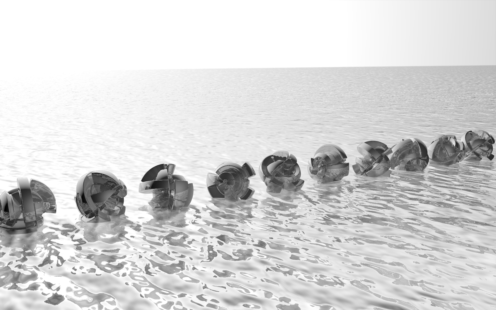
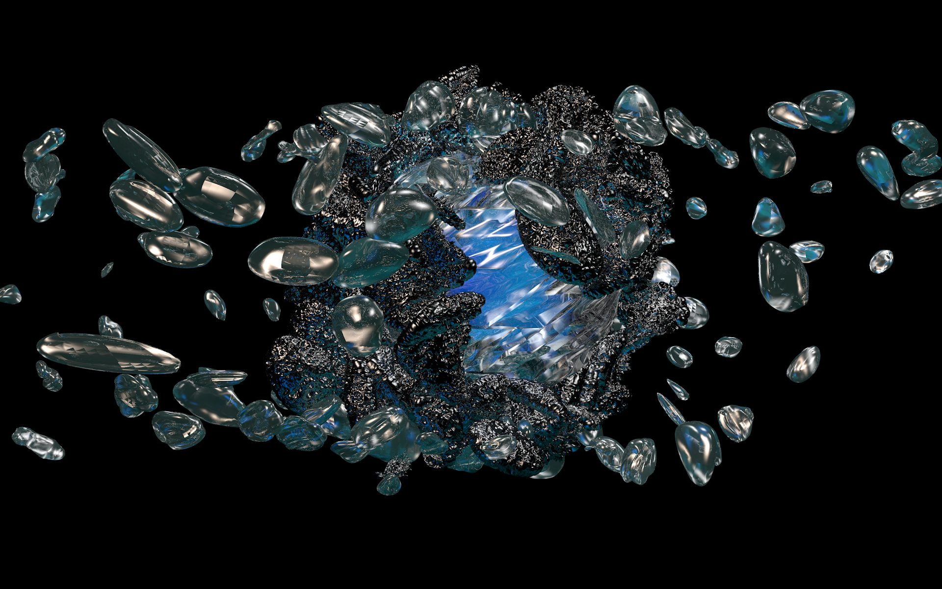
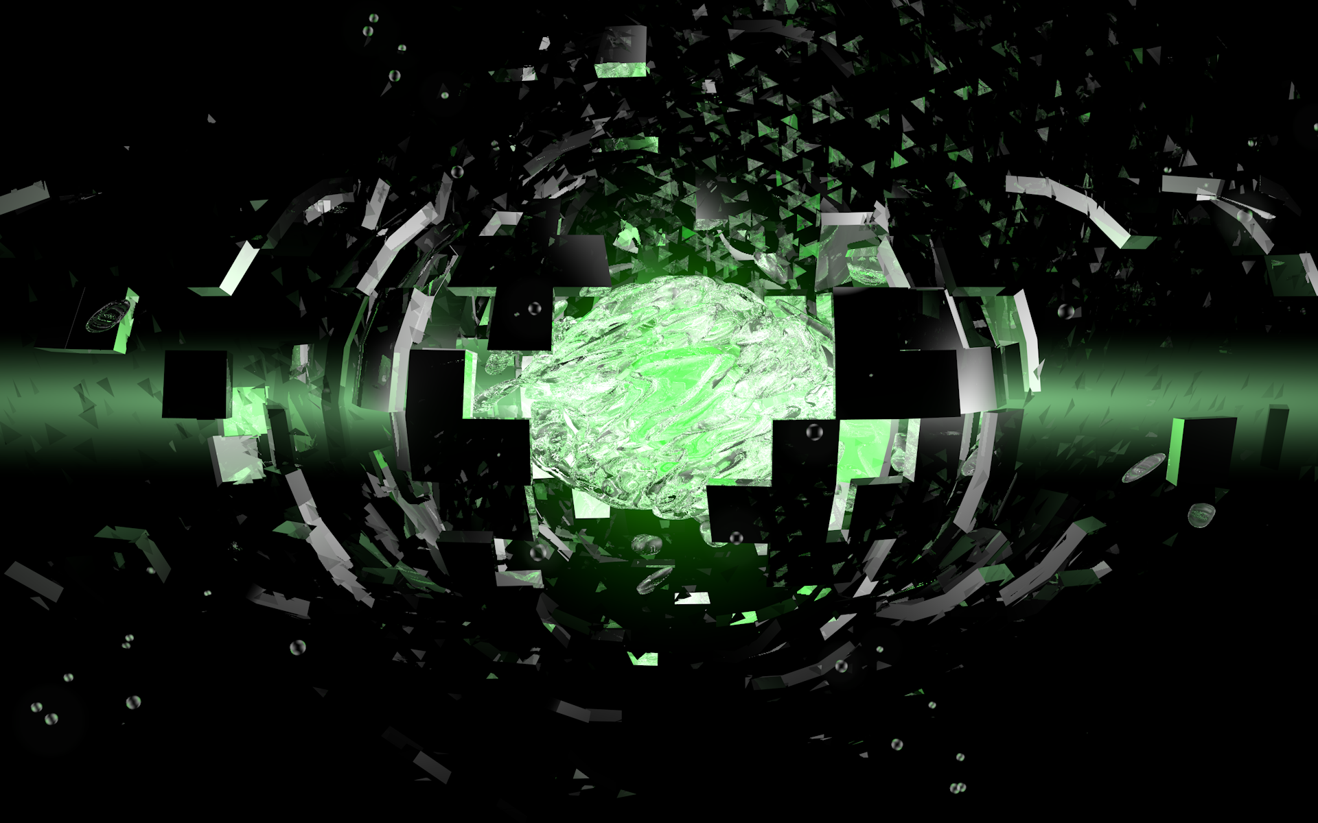
@Coloriot: Okay, I'll start making more; I should be able to finish the pack within a week or two depending on school schedules
@Berri: Okay, looks like VirtuaDJ font and a broken gradient background; can do.
@Metrix: I think I can do that; could you give me an example of something close to what you are looking for?
Alycs's Art and Stuff
65 posts
• Page 3 of 3 • 1, 2, 3
Re: Alycs's Cover Art and Wallpapers [Requests Open]
Soundcloud||Tumblr||Youtube||Graphics||Bandcamp
Freewave wrote:being too critical can make you too critical
-

Alycs - Posts: 960
- Joined: 23 Sep 2012 13:40
- OS: Windows
- Primary: FL Studio
- Cutie Mark: ( ͡° ͜ʖ ͡°)
-

Ricky Denzel - Posts: 1487
- Joined: 12 Mar 2012 15:15
- Location: Valdosta, GA
- OS: Anything
- Primary: Ableton Live 8
- Cutie Mark: Triangle with an eye
Re: Alycs's Cover Art and Wallpapers [Requests Open]
Okay, looks like VirtuaDJ font
for your information i used deluxe font, SISTAH
http://cooltext.com/Download-Font-DeluxeFont
https://soundcloud.com/theberri
https://www.tumblr.com/blog/notberri
https://www.tumblr.com/blog/notberri
Circuitfry wrote:I'm a certified professional with venturing into butts.
JacksonMiller wrote:Wow ExoBassTix, you really like the D. ;)
-

Berri - Posts: 349
- Joined: 01 Sep 2013 09:16
- Cutie Mark: ( ͡O ͜ʖ ͡O ) ovi
Re: Alycs's Cover Art and Wallpapers [Requests Open]
Okay, Metrix, here is your cover-art:

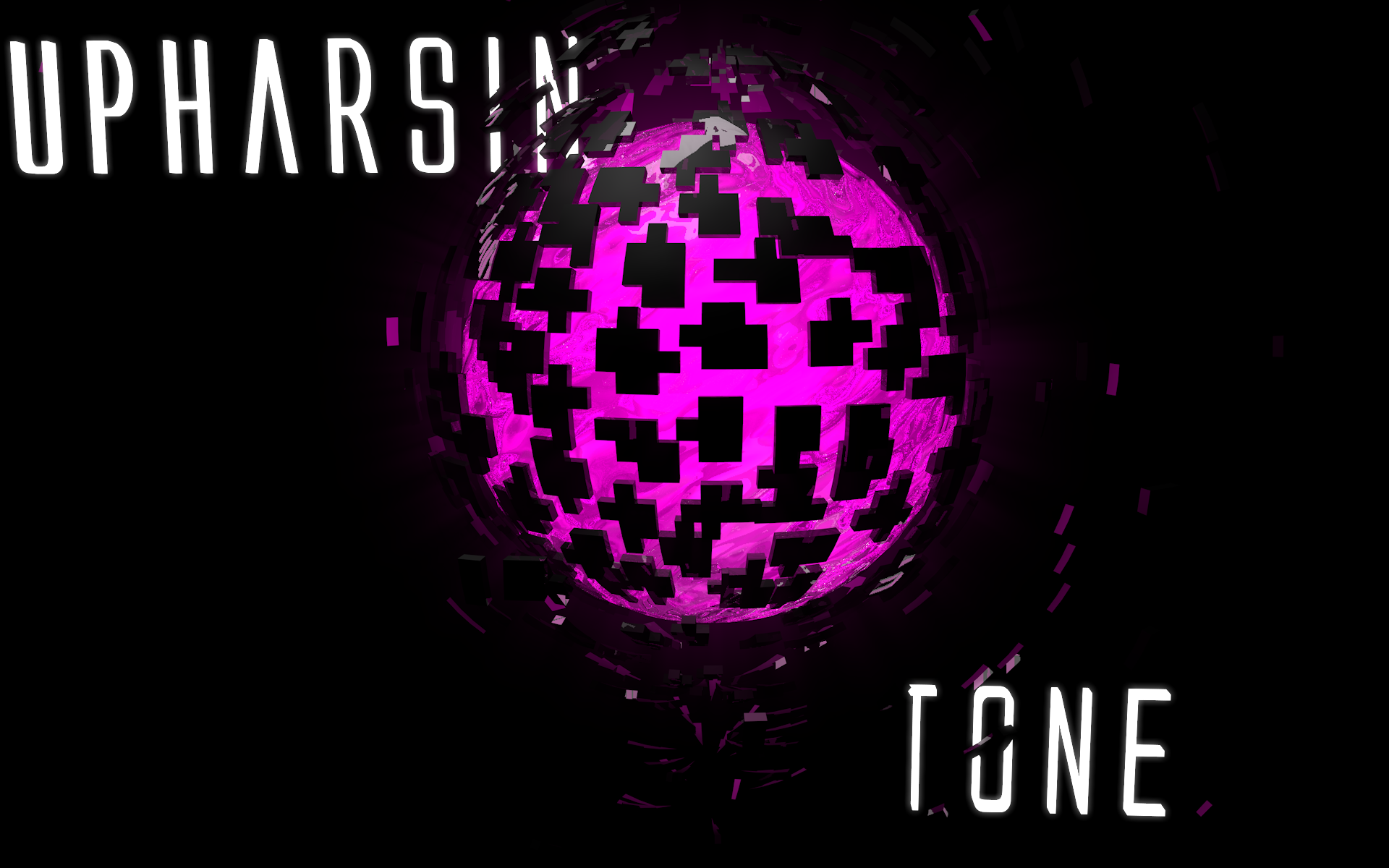
Berri, here is a rough logo I drafted up. After listening to your music (Better Bass and The Berri in particular) I was getting a more "rough" feel from your music. I kept some of the pixelation (in the form of the "dissolving" letters) and the background design in the floating boxes. If you want anything changed, just tell me.


Berri, here is a rough logo I drafted up. After listening to your music (Better Bass and The Berri in particular) I was getting a more "rough" feel from your music. I kept some of the pixelation (in the form of the "dissolving" letters) and the background design in the floating boxes. If you want anything changed, just tell me.

Soundcloud||Tumblr||Youtube||Graphics||Bandcamp
Freewave wrote:being too critical can make you too critical
-

Alycs - Posts: 960
- Joined: 23 Sep 2012 13:40
- OS: Windows
- Primary: FL Studio
- Cutie Mark: ( ͡° ͜ʖ ͡°)
Re: Alycs's Cover Art and Wallpapers [Requests Open]
Alycs wrote:Okay, Metrix, here is your cover-art:
I can't see it. Can you put it in ohotobucket or something?
-

Ricky Denzel - Posts: 1487
- Joined: 12 Mar 2012 15:15
- Location: Valdosta, GA
- OS: Anything
- Primary: Ableton Live 8
- Cutie Mark: Triangle with an eye
Re: Alycs's Cover Art and Wallpapers [Requests Open]
Berri, here is a rough logo I drafted up. After listening to your music (Better Bass and The Berri in particular) I was getting a more "rough" feel from your music. I kept some of the pixelation (in the form of the "dissolving" letters) and the background design in the floating boxes. If you want anything changed, just tell me.
Cool i like it, but can you do a version without the floating boxes for me please(i'll probably use them both for different situations).
also
After listening to your music (Better Bass and The Berri in particular)
i don't have a song called "the berri" could you tell me which song that was because there are couple i'm not exactly proud
finally thanks a bunch for doing this and sorry for long answer.
https://soundcloud.com/theberri
https://www.tumblr.com/blog/notberri
https://www.tumblr.com/blog/notberri
Circuitfry wrote:I'm a certified professional with venturing into butts.
JacksonMiller wrote:Wow ExoBassTix, you really like the D. ;)
-

Berri - Posts: 349
- Joined: 01 Sep 2013 09:16
- Cutie Mark: ( ͡O ͜ʖ ͡O ) ovi
Re: Alycs's Cover Art and Wallpapers [Requests Open]
Sure, here:

And looking back it was called "Gabba" (the first one in your signature)
@Metrix: Hmmm... thats odd, I'll try uploading it to photobucket in a little bit.

And looking back it was called "Gabba" (the first one in your signature)
@Metrix: Hmmm... thats odd, I'll try uploading it to photobucket in a little bit.
Soundcloud||Tumblr||Youtube||Graphics||Bandcamp
Freewave wrote:being too critical can make you too critical
-

Alycs - Posts: 960
- Joined: 23 Sep 2012 13:40
- OS: Windows
- Primary: FL Studio
- Cutie Mark: ( ͡° ͜ʖ ͡°)
Re: Alycs's Cover Art and Wallpapers [Requests Open]
ahhhh that wip thank you and have a good day sir.
i need nothing more of you.
i need nothing more of you.
https://soundcloud.com/theberri
https://www.tumblr.com/blog/notberri
https://www.tumblr.com/blog/notberri
Circuitfry wrote:I'm a certified professional with venturing into butts.
JacksonMiller wrote:Wow ExoBassTix, you really like the D. ;)
-

Berri - Posts: 349
- Joined: 01 Sep 2013 09:16
- Cutie Mark: ( ͡O ͜ʖ ͡O ) ovi
Re: Alycs's Cover Art and Wallpapers [Requests Open]
Alycs wrote:
@Metrix: Hmmm... thats odd, I'll try uploading it to photobucket in a little bit.
thanks
-

Ricky Denzel - Posts: 1487
- Joined: 12 Mar 2012 15:15
- Location: Valdosta, GA
- OS: Anything
- Primary: Ableton Live 8
- Cutie Mark: Triangle with an eye
Re: Alycs's Cover Art and Wallpapers [Requests Open]
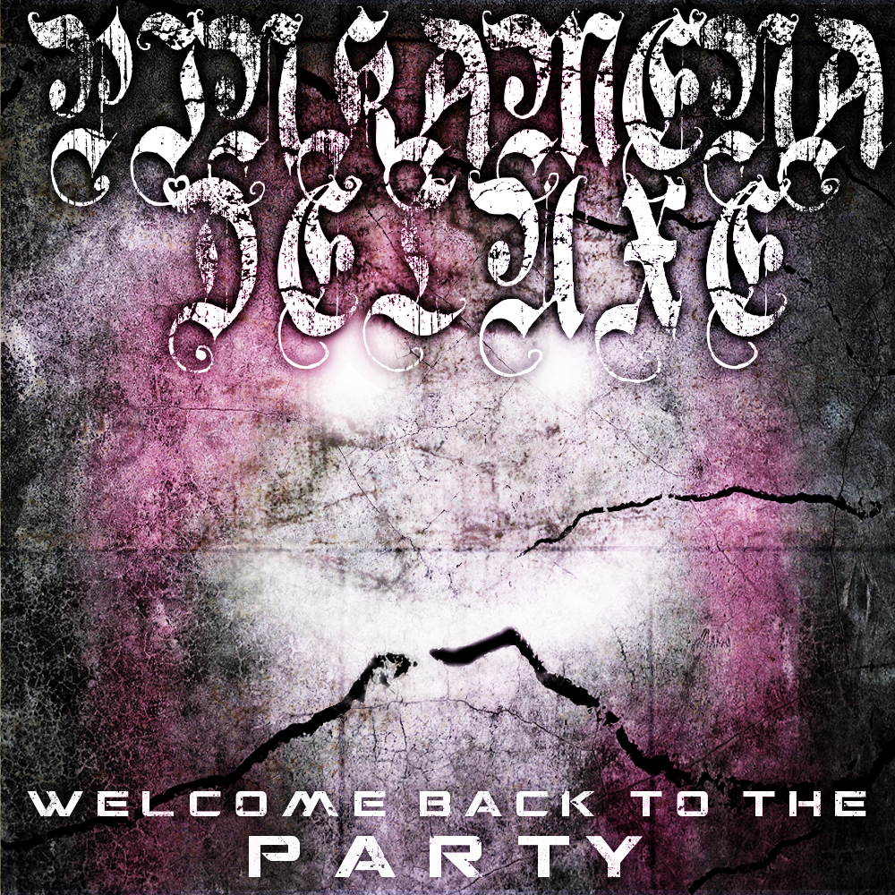
Does that work?
Soundcloud||Tumblr||Youtube||Graphics||Bandcamp
Freewave wrote:being too critical can make you too critical
-

Alycs - Posts: 960
- Joined: 23 Sep 2012 13:40
- OS: Windows
- Primary: FL Studio
- Cutie Mark: ( ͡° ͜ʖ ͡°)
Re: Alycs's Cover Art and Wallpapers [Requests Open]
Alycs wrote:
Does that work?
Yeah! Thanks, brah!
-

Ricky Denzel - Posts: 1487
- Joined: 12 Mar 2012 15:15
- Location: Valdosta, GA
- OS: Anything
- Primary: Ableton Live 8
- Cutie Mark: Triangle with an eye
Re: Alycs's Cover Art and Wallpapers [Requests Open]
You're welcome
Also, I'm going to be temporarily closing requests. I have a lot of stuff I'm really busy with right now *coughcollegeessayscough* and I'm working on that and don't have a ton of time to do these.
If you need cover-art for an album, you can still post here, but it will probably take longer than it would have before. Avatars and logos and stuff are off; they just take too much time and brainpower.
@Coloriot: I'll still finish up your wallpaper pack, so far I have 6 wallpapers done.
Soundcloud||Tumblr||Youtube||Graphics||Bandcamp
Freewave wrote:being too critical can make you too critical
-

Alycs - Posts: 960
- Joined: 23 Sep 2012 13:40
- OS: Windows
- Primary: FL Studio
- Cutie Mark: ( ͡° ͜ʖ ͡°)
Re: Alycs's Art and Stuff [Requests Temporarily Closed]
Okay, Coloriot, I think I finally have a good collection of papers. Some of them are a little plain, some are pretty complex. Sadly, I never got the 3D paint rendering program to work, so there's only one real "painted" looking one, but there is still a good amount.
You can download the papers here, they are all in 1920x1200, so unless your monitor is a TV screen, they should work:
https://www.dropbox.com/s/6iq84zzgk8gk206/Coloriot.zip
Enjoy
You can download the papers here, they are all in 1920x1200, so unless your monitor is a TV screen, they should work:
https://www.dropbox.com/s/6iq84zzgk8gk206/Coloriot.zip
Enjoy
Soundcloud||Tumblr||Youtube||Graphics||Bandcamp
Freewave wrote:being too critical can make you too critical
-

Alycs - Posts: 960
- Joined: 23 Sep 2012 13:40
- OS: Windows
- Primary: FL Studio
- Cutie Mark: ( ͡° ͜ʖ ͡°)
Re: Alycs's Art and Stuff
Bump just in case Coloriot didn't see;
Also, new artwork and updated OP:
Also, new artwork and updated OP:
Spoiler Wallpapers:
Soundcloud||Tumblr||Youtube||Graphics||Bandcamp
Freewave wrote:being too critical can make you too critical
-

Alycs - Posts: 960
- Joined: 23 Sep 2012 13:40
- OS: Windows
- Primary: FL Studio
- Cutie Mark: ( ͡° ͜ʖ ͡°)
Re: Alycs's Art and Stuff
Not sure if you are still busy with essays. But could I request an album art for my album: Ovrdrv - Nightmares and Dreamscapes?
It's Electric
My Youtube is: https://www.youtube.com/OfficialTotalspark
My Soundcloud is:https://www.soundcloud.com/officialovrdrv
My first album!!!: http://www.totalspark.bandcamp.com
My Youtube is: https://www.youtube.com/OfficialTotalspark
My Soundcloud is:https://www.soundcloud.com/officialovrdrv
My first album!!!: http://www.totalspark.bandcamp.com
-

Totalspark - Posts: 79
- Joined: 28 Sep 2013 23:33
- Location: The Moon
- OS: Windows 10
- Primary: Fl Studio 20
- Cutie Mark: blank
65 posts
• Page 3 of 3 • 1, 2, 3
Return to Pony Fan Works Gossip
Who is online
Users browsing this forum: No registered users and 2 guests

