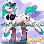
CitricAcid wrote:Freewave wrote:Here's a QUICK mock up (i took the deactivated brony artist directory and redesigned it) of what it could look like with some art i had at hand. This will not be the url or the site obviously....
Would love a purple ring around the png to make it a bit more "banner-ish if anyone knows how to do that in psp." Again a quick but professional (?) design for the time being with the proposed name in tow.
I have some basic suggestions based on that mockup. Assuming this is going to be remain tumblr-based, I would pick a layout that makes better use of the horizontal page space. And is there a way to make the background image stay put while the blog in the foreground scrolls? Tiled backgrounds always remind me of ytmnd background images and crummy myspace pages.
For the record, I'm not very blog-savvy, so forgive me if my suggestions are totally out of line.
I think the none-scrolling BG image will work great. we also need to decide on a very appealing layout. We need to have people that visit the site want to come back and not feel like its an eye-sore in any which way.
Also, we should really decide if this is going to primarily tumblr based or a dedicated site.
I personally vote for a dedicated site with the tumblr being kind of like the newsletter of sorts that talks about what's going on at fimmusic, and have fimmusic the place where all the content is primarily presented for an audience to follow their favorite musicians easily, see stuff happening in the music sector, etc. I think this needs to be focused on the consumer interest first, but still have producers want to be a part of the consumer action and want to create site content as well. Basically I agree with a lot of what ClaviSound said, music first and foremost.